TYPOGRAPHY - TASK 1/ EXERCISE
Typography - Task 1
Lecture 1 : Typo_0_Introduction
Uncials
Flush right with ragged left text

Anatomy of typeface
Different typefaces show the different gray values
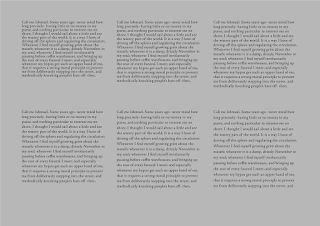
Different leading in Adobe Jenson
Sample type specimen sheet
Example of Static Typography
Example of Motion Typography in Title Sequence (Movie: Se7en)
Instruction
2.2 Sick
I chose the font ITC Garamond Std to make the letter sick. When I think of the word sick, I thought of things like syringe, pills and so on (basically medical stuffs).
2.4 Freedom
For freedom, I made my attempt on the sketch idea I had which was to make a balloon of one of the letters to fly away from the other letters to make it seem like it was free escaping away from the others. On the second attempt, I was given feedbacks that the fonts were not suitable to express the word.
April 4th, 2023.
04.04.2023 - 05.05.2023 / Week 01 - Week 06
Thanaphorn Daensaad / 0350930
Typography / Bachelor of Design (Hons) In Creative Media
Thanaphorn Daensaad / 0350930
Typography / Bachelor of Design (Hons) In Creative Media
LECTURES.
Lecture list
Lecture 2 : Typo_1_Development
Lecture 6 : Typo_5_Understanding
Lecture 3 : Typo_2_Text_P1
Lecture 7 : Typo_6_Screen & Print
Lecture 4 : Typo_3_Text_P2
Lecture 1 : Typo_0_Introduction
On our first lecture, Mr Vinod gave us a quick glimpse on the introduction to
typography, also known as an act of creating letter shapes/typefaces.
Typography is described as "the style and appearance of printed matters" on
oxforddictionaries.com. According to Wikipedia, typography is described
as "the art and technique of arranging type to make written language more
legiblel, readable and appealing when displayed". Typography is used in app
and website design, logotypes, animated forms and etc.
At the end of the lecture, I was learnt to differentiate between the two
widely used terminology.
FONT : individial font or weight within typefaces such as Georgia Regular, Georgia Italic and Georgia Bold
FONT : individial font or weight within typefaces such as Georgia Regular, Georgia Italic and Georgia Bold
TYPEFACE : the entire family of fonts/weights that share similar
characteristics/styles such as Georgia, Arial, Times New Roman, Didot and
Futura.
Fig 1: Difference between typeface and font
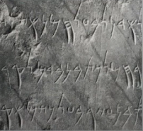
4th century B.C.E - Phoenicians Votive Stele Carthage
Evolution from Phoenician Letter
Evolution from Phoenician to Roman
Lecture 2 : Typo_1_Development
Early Letterform Development : Phoenician to Roman
In the early days, writing was originally scratching into wet clay with a sharpened stick or carved into a stone using a chisel. Uppercase forms were used for nearly 2000 years and have evolved around these tools and materials, the forms were mainly built up of straight lines and circles.
In the early days, writing was originally scratching into wet clay with a sharpened stick or carved into a stone using a chisel. Uppercase forms were used for nearly 2000 years and have evolved around these tools and materials, the forms were mainly built up of straight lines and circles.
4th century B.C.E - Phoenicians Votive Stele Carthage
Evolution from Phoenician Letter
Writing directions
Phoenicians, like other Semitic peoples, wrote from right to left. The Greek
developed their own writing called 'boustrophedon' (how the ox ploughs)
which the lines of text read alternately from the right to left and left to
right. They both have the similarity of not using letter space and
punctuation.
'Boustrophedon' writing style
Etruscan (before Roman) cravers paints letterform on marble before
inscribing. The qualities of their strokes in terms of the change in weight
from vertical to horizontal and the broadening of the stroke at start and
finish carried over into the carved letterforms.
Evolution from Phoenician to Roman
Hand script from 3rd - 10th century C.E.
Square Capitals can be found in Roman monuments. They have serifs added to the finish of the main strokes with a reed pen at a 60 degree angle off the perpendicular.
Rustic Capitals is the compressed version of square capitalist that allows twice as many words on a parchment with lesser time to write. The pen or brush is angled at 30 degree angle off the perpendicular. The style of writing is slightly harder to read due to its compressed nature.
Rustic Capitals (Late 3rd - mid 4th century)
Lowercase letterform - square and rustic capitals are used in
everyday lives which is typically writen in cursive then simplified for
speed and became what we refer to as lowercase letterform.
4th century: Roman cursive
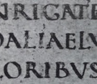
Uncials
-incorporated some aspects of the roman cursive hand (A,D,E,H,M,U and Q)
-'Unicia' is a Latin word for twelfth of anything,therefore, scholars believed
it refers to letters that are one inch/one twelfth of foot high.
Half- Uncials
Half- Uncials
- marks the beginning of lowercase forms, replete with ascenders
and descenders.
4th or 5th century Uncials
500: half-uncials
Standardised caligraphy
Charlemagne, the first unifier of Europe since the Romans, issued an
edict in 789 to standardize all ecclesiastical texts. This task was entrusted
to Alcuin of York, Abbot of St Martin of Tours. The monks rewrote the texts
using both majuscules (uppercase), miniscule, capitalization and punctuation
which set the standard for calligraphy for a century.
925: Caloline miniscule
Backletter to Gutenberg's type
Dissolution of Charlemagne's empire caused regional variations upon
Alcuin's script. In Northern Europe, a condense strongly vertical
letterform, Black letter or textura gained popularity. In the south, a
rounder more open hand gained popularity, rotunda. The humanistic script in
Italy is based on Alcuin's miniscule.
1300, Blackletter (Textura)
Text Type Classification
Typeforms have developed in response to prevailing technology, commercial needs and esthetic trends.
The following type form classification here, based on one devised by Alexander Lawson only covers the main form of text type.
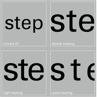
normal, loose and tight tracking
Text Type Classification
Typeforms have developed in response to prevailing technology, commercial needs and esthetic trends.
The following type form classification here, based on one devised by Alexander Lawson only covers the main form of text type.
Lecture 3 : Typo_2_Text_P1
Text / Tracking: Kerning and Letterspacing
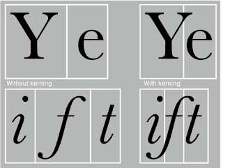
Kerning
Refers to the automatic adjustment of space between letters. It is adjusted in making the headlines.
Refers to the automatic adjustment of space between letters. It is adjusted in making the headlines.
Letters with and without kerning
Tracking
Refers to the addition and removal of space in a word or sentence.
Refers to the addition and removal of space in a word or sentence.
Normal tracking allows a easy readibility
Loose tracking and tight tracking reduces the readibility of the word or sentence. Counter form of the negative spaces between the strokes is important to consider.
Loose tracking and tight tracking reduces the readibility of the word or sentence. Counter form of the negative spaces between the strokes is important to consider.
Text / Formatting Text
Flush left is the most natural way of formatting text that mirrors the
asymmetrical experience of handwriting. Each lines starts at the same
point but ends wherever the last word on the line ends. Spaces between
words are consistent throughout the text allowing the type to create an
even gray value. This format has a ragged line created by the end lines on
the right.
Flush left with ragged right text
Centered is the format that imposes summetry upon text with equal value
and weight to both ends of lines. It transforms fied text into shapes.
Therefore, it is important to amend line breaks so the text does not
appear too jagged.
Centered formatting text
Flush right is the format that emphasis on the end of line as opposed to
its start. It is useful in situations like captions where relationship
between text and imahe might be ambiguous without a strong orientation to
the right.
Justified is the format the imposes a summetrical shape on the text. It is
achieved by expanding or reducing spaces between words and sometimes
letters. The resulting openness of lines can occasionally produce 'rivers'
of white space running vertically through the text. Careful attention to
line breaks and hyphenation is required to amend this problem.
Texture
A typeface with a relatively generous x-height or relatively heavy stroke
width produces darker mass on the page than a type with a relatively
smaller x-height or lighter stroke. Sensitivity to these differences in
colour is fundamental for creating successful layouts.

Anatomy of typeface
The differences in gray values can be seen in different typefaces. A
typeface with a middle gray value would be the best in a particular
layout.
Leading and Line Length
Type size should be large to be readable at arm's length
Type size should be large to be readable at arm's length
Leading refers to the space between adjacent lines of the typeface
Tight leading and loose leading

Different leading in Adobe Jenson
Line length is the number of characters in a line. A good rule of thumb
is to keep the line length between 55-65.
Type Specimen Book
Type Specimen Book
A type specimen book shows samples of typefaces in various different
sizes. It is used as a reference for the outcomes of a typeface in terms
of type size, leading, line length, etc to decide the right type.
Text should create a field that occupies page or screen. The ideal text
is to have a middle gray value. Type should be enlarge to 400% on screen
to get a clear sense of the relationship between descenders on one line
and ascenders on the line below. If the outcome is on printed page, it
is best to print out to look at the details closely. If its on the
screen, judging on screen would be accurate.
Lecture 4: Typo_3_Text_P2
Indicating Paragraphs
Indicating Paragraphs
Paragraph indicators can be used in several choices, one of it is
'Pilcrow' (¶),a holdover from medival manuscript.

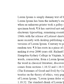
Line spacing used in a paragraph
Standard indentation's indent have the same size as line spacing or same as the point size of the text.

Pilcrow used in a paragraph
Line space (leading) between paragraphs is another option to
indicate paragraph, this is achieved by having the line space and
paragraph space at the ssame size( line space = paragraph space =
12pt)

Line spacing used in a paragraph
Standard indentation's indent have the same size as line spacing or same as the point size of the text.
Standard indication used in a paragraph
Extended paragraphs create unusually wide columns of text. Though, there
could be potential of strong compositional or functional reasoning in
choosing it.
Extended paragraph
Widows and Orphans
Two unpardonable gaffes in traditional typesetting
Two unpardonable gaffes in traditional typesetting
Widow refers to the short line of the tupe left alone at the end
of a column of text. It can be avoided by creating a force line break
before or adjusting the tracking of the line before to let the last word
in the second last line moves down to the last line.
Orphan refers to short line of the type left alone at the start
of a new column. It could be avoided by adjusting the length of the
column.
Widow and orphan
Highlighting text
Few examples of highlighting text
- using the same typeface but different fonts such as Italic, Bold or colour.
- using the same typeface but different fonts such as Italic, Bold or colour.
-using bold sans serif
-highlighting with colour
-using typographic elements
-using quotation mark
Examples of quotation marks in paragraph (left) and differences of
prime and quotation (right)
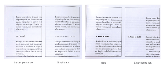
Headline Within Text
There are many kinds of subvision within text of chapters. In following
visuals theses have been labeled (A,B and C) acccording to level of
importance.
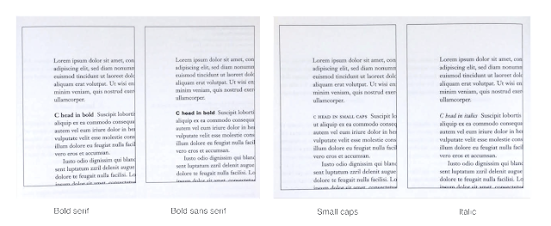
A head indicates a clear break between the topics within a section
B head subordinate to A heads. B heads indicate a new supporting
argument or example for the topic at hand.

C heads highlight specific facet of material within B head text in small
caps, italics, serif bold and san serif bold. In this configuration, they
are followed by at least an empty space for visual separation.
Cross Alignment
Cross aligning headlines and captions with text type reinforces the architectural sense of the page—the structure— while articulating the complimentary vertical rhythms. Example below shows one line of headline type cross-aligns with two lines of text type and four lines of headline type cross-align with five lines of text type.
Cross aligning headlines and captions with text type reinforces the architectural sense of the page—the structure— while articulating the complimentary vertical rhythms. Example below shows one line of headline type cross-aligns with two lines of text type and four lines of headline type cross-align with five lines of text type.
Lecture 5: Typo_4_Basic
Basics / Describing letterforms
Describing letterforms
- Baseline : imaginary line at the base of the letterforms
- Median : the imaginary line defining the x-height of letterforms
- X-height : height in any typeface of the lowercase 'x'
- Stroke : any line that defines the basic letterform
- Apex / Vertex : the point created by joining two diagonal stems
- Arm : short strokes off the stem of the letter form (horizontal: E,F,L inclined upward: K,Y)
- Ascender : the portion of the stem of a lowercase letterform that projects above the median
- Barb : half-serif finish on some curved stroke
- Beak : half-serif finish on the same horizontol arms
- Bowl : rounded form that describes a counter
- Bracket : transition between the serif and the stem
- Cross Bar : horizontal stroke in a letterform that joins two stems together
- Cross Stroke : horizontal stroke in a letterform that joins two stems together (lowercase f & t)
- Crotch : interior space where two stroke meets
- Descender : portion of the stem of a lowercase letterform that projects below the baseline
- Ear : stroke extending out from the main stem or body of letterform
- Em/en : originally referring to the width of uppercase M, now refers to the distance equal to the size of typeface; en is half the size of an em
- Finial : rounded non-serif terminal to a stroke
-
Leg : short stroke off the stem of the letterform (at the bottom of
L, inclined downward: K,R)
- Ligature : character formed by the combination of two or more letterforms
- Link : stroke that connects the bowl and the loop of lowercase G
-
Loop : bowl created in the descender of lowercase G (in some
typefaces)
- Serif : right-angled or oblique foot at the end of the stroke
- Shoulder : curved stroke that is not part of a bowl
- Spine : curved stem of S
- Spur : extension that articulated the junction of the curved and rectilinear stroke
- Stem : significant vertical or oblique stroke
- Stress : orientation of the letterform, indicated by the thin stroke in round forms
- Swash : flourish that extends the stroke of the letterform
- Tail : curved diagonal stroke at the finish of certain letterforms
- Terminal : self-contained finish of a stroke without a serif.
The font
The full font of a typeface contains much more than 26 letters, to
numerals and a few punctuation marks.
Small capitals
Uppercase letterforms draw to the x-height of the typeface
Example of uppercase letterform in x-height (top) and normal
uppercase letterform (bottom)Uppercase letterforms draw to the x-height of the typeface
Uppercase numerals (lining figures)
same height as uppercase letters and are all set to the same kerning width
Lowecase numerals (old style figures or text figures)
set to x-height with ascenders and descenders
Sample of Uppercase and lowercase numeralssame height as uppercase letters and are all set to the same kerning width
Lowecase numerals (old style figures or text figures)
set to x-height with ascenders and descenders
Italic
refer to the fifteenth century Italian cursive handwriting
refer to the fifteenth century Italian cursive handwriting
Punctuation, miscellaneous characters
miscellaneous character varies from typefaces while the punctuation marks remain standard
miscellaneous character varies from typefaces while the punctuation marks remain standard
Ornaments
flourishes in invitation or certificates and only available in
traditional or classical typefaces
Describing Typefaces
Roman
called as it is because the uppercase form was derived from inscriptions of Roman monuments. A slightly lighter stroke in Roman is known as 'Book'.
called as it is because the uppercase form was derived from inscriptions of Roman monuments. A slightly lighter stroke in Roman is known as 'Book'.
Italic
based on the 15th century Italian handwriting
based on the 15th century Italian handwriting
Oblique
based on roman form of typeface
Boldface
characterized by thicker stroke than roman.
Light
a lighter stroke than roman form, lighter strokes are called 'thin'
Condense
a version of the roman form and extremely condense style are often
called 'compressed'
Extended
extended version of a roman font
LECTURE 6 : Typo_5_Understanding
Understanding letterforms
The uppercase letterforms suggest symmetry but it's not symmetrical. Both Baskerville and Univers demonstrate the meticulous care a type designer takes to create a letterform that are internally harmoniously and individually expressive.
The uppercase letterforms suggest symmetry but it's not symmetrical. Both Baskerville and Univers demonstrate the meticulous care a type designer takes to create a letterform that are internally harmoniously and individually expressive.
Baskerville stroke form with two different stroke weights
(Left) and Univers stroke form with thinner left slope than the
right (Right).
Each individual letterform is neatly demonstrated by examining the
lowercase 'a' of two similar looking sans-serif typefaces (Helvetica and
Univers).
Comparison of Helvetica and Univers
Maintaining x-height
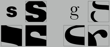
X-height is the size of lowercase letterforms, curved strokes such as in the letter 's' must rise above the median (or sink below the baseline) to appear the same size as the vertical and horizontal strokes.
X-height is the size of lowercase letterforms, curved strokes such as in the letter 's' must rise above the median (or sink below the baseline) to appear the same size as the vertical and horizontal strokes.
Letter/forms/counterform
the area of a letter that is entirely or partially enclosed by a letter
form or a symbol. One effective method to understand the form and
counter of letter is by examining them in close detail.
Helvetica Black
Baskerville
Contrast
The design principle 'contrast' is also applied in typography. The simple contrasts produce numerous variations: small+organic / large+machine, small+dark/large+light, and more.
The design principle 'contrast' is also applied in typography. The simple contrasts produce numerous variations: small+organic / large+machine, small+dark/large+light, and more.
Contrast in fonts produces variation of pairings
Lecture 7: Typo_6_Screen & Print
Typography in Different Medium
Typography in Different Medium
In the present, typography exists on different mediums ranging on from
thr traditional way which is the paper to multitude screens. It is
subject to many unknown and fluctuating parameters, such as the
operating system, system fonts, the device and the screen itself.
Type for Print
The type was designed intended for reading from print long before reading from a screen. Therefore, designers should ensure that the text is smooth, flowing and pleasant to read.
The type was designed intended for reading from print long before reading from a screen. Therefore, designers should ensure that the text is smooth, flowing and pleasant to read.
Typefaces for print: Calson, Garamond, Baskerville, Univers (reason
being: elegant and intellectual, highly readable at small font size)
Type for Screen
Typefaces used for the web are optimized and often modified to enhance
readability and performance on screen in variety of digital enviroment.
This includes taller x-height (or reduced ascenders and descenders),
wider letterforms, more open counters, heavier thin strokes and serifs,
reduced stroke contrast, modified curves and angles and finally more
open spacing.
Font size: about 16 pixels and the same size as at least 12 points
System fonts for screen/ web safe fonts: Open Sans, Lato, Arial,
Helvetica, Times New Roman, Times Courier New, Courier, Verdana,
Georgia, Palatino and Garamond.
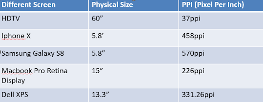
Pixel Differential between Devices:
Screens used by PCs, Tablets, Phones and TVs not only have different
sizes but also the text on-screen differs in proportion too, because
they have different size pixels.
Static typography:
Static typography has minimal characteristics in expressing words. This
type of typography are used in wide range of purposes from billboards to
poster to magazines and also flyers.
Motion Typography:
Temporal media offer typographers to "dramatize" type, by making
letterforms more fluid and kinetic. Motion graphics, the brand
indentities of film and television production companies shows an increas
in animated type content.
Music Videos and Ads: sets in motion following the rhythm of a
soundtrack
Title sequences: typography plays a huge role in prepareing the audience
for the film by evoking a certain mood
Instruction
TASK 1: Exercise 1- Type Expression
For this task, we were given time to think of some words to narrow down to
seven word choices which are crush, dissipate, sick, rain, freedom, fire and
water. From the ones above, we were then choose any four words to
sketch in various ways to bring out the word expression.
Sketching Phase
I have chosen : sick, crush, sick and rain.
I have chosen : sick, crush, sick and rain.
Fig 1 Type expression sketches for rain and water, Week 2 (10/4/2023)
Fig 2 Type expression sketches for freedom and sick, Week 2
(10/4/2023)
Digitilization Phase
During this phase, I played around with the 10 fonts given to be used for the module to express the word.
2.1 Water
During this phase, I played around with the 10 fonts given to be used for the module to express the word.
2.1 Water
I use the font Futura in making the word expression water. I enlarged the
letter W to make it look like it is a container or glass with the letters A,
T, E and R as the water element pouring out of the letter W.
Fig 3 first attempt on water week 3(18/4/2023)
After getting feedbacks, I was suggested to add on water droplets around it to
bring out the water element more as it looks more natural that way.
Fig 4 amending awater week 3(18/4/2023)
2.2 Sick
I chose the font ITC Garamond Std to make the letter sick. When I think of the word sick, I thought of things like syringe, pills and so on (basically medical stuffs).
Fig 5 first attempt on sick week 3(18/4/2023)
Fig 6 second attempt on sick week 3(18/4/2023)
2.3 Rain
For rain, my idea is to implement the visual of the rain as the element to
show that the word is rain. I used the letter i to make it look like the
raindrops pouring. I attempted them in different angle of rain. By lowering
the opacity and scaling the letters, I was able to make it look like it had
almost fallen to the ground.
Fig 7 first attempt on rain week 3(18/4/2023)
Fig 8 second attempt on rain week 3(18/4/2023)
For freedom, I made my attempt on the sketch idea I had which was to make a balloon of one of the letters to fly away from the other letters to make it seem like it was free escaping away from the others. On the second attempt, I was given feedbacks that the fonts were not suitable to express the word.
Fig 9 first attempt on freedom week 3(18/4/2023)
Fig 10 second attempt on freedom after getting feedbacks week 3(18/4/2023)
Final Design
Fig 11 final compilation of four words week 3(18/4/2023)
Fig 12 final compilation of four words (pdf) week 3(18/4/2023)
Animation
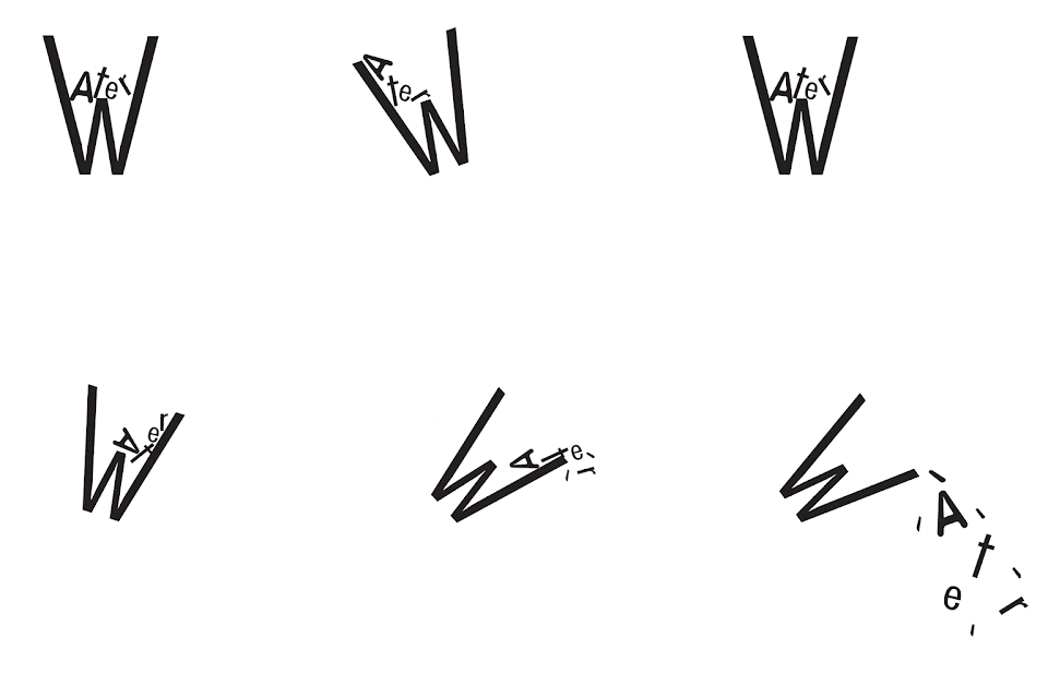
For this task, we are required to choose one from the final four type expressions to make an animated type expression. I chose to make the water word expression animated. Before starting, we were told to watch the animation tutorial to get a jizz on how to make the frames on adobe illustrator and how to make the frame animation on photoshop. He advised us to visualise how the word would move in every frame to get a smooth animation.
I started off with studying the dynamics of water movement in order to capture an accurate water movement for the animation.
Fig 12 making frames week 3 (20/4/2023)
I came out with making the glass wobbling around then pouring out of the
glass. I wanted to capture more on the movement on water.
Fig 13 Attempt #1 of animating water week 3 (20/4/2023)
Final outcome after getting feedbacks from lecturer and friends
Fig 14 Final Animated Type Expression "water" GIF, Week 4 (25/04/2023)
TASK 1: Exercise 2 - Text Formatting
For this exercise, we have to create a layout of text formatting, working with
typefaces, typesize, leading,line length, etc.
1. Kerning and tracking exercise
We are assigned to work with kerning and tracking with our name using the 10
typefaces provided. We are allowed to use different fonts and type sizes in a
typeface.
Fig 2.1 Text formatting - before and after kerning week 4
(25/4/2023)
2. Layout Exercise
For this exercise, we needed to create a final layout using the text given and
edit the text formatting. We also have to find a black and white picture that
is suitable to the given text and include it in the layout. The exercise is a
way to create a better understanding on text formatting and more attentive to
small details in order to create a good layout.
Layout #1
Head
Fonts: Bodoni MT Bold (headline), Gill Sans regular (byline)
Type sizes: 36pt (headline), 12pt (byline)
Type sizes: 36pt (headline), 12pt (byline)
Leading: 43.2pt (headline), 14.4pt (byline)
Paragraph spacing: -
Body
Fonts: Adobe Caslon Pro Italic and Bembo Std (regular)
Type size: 10pt
Leading: 12pt
Paragraph spacing:
Allignment: Ragged left
Margins: 12.9mm (top), 15mm (bottom)
Column:4
Gutter: 4.23 mm
Paragraph spacing:
Allignment: Ragged left
Margins: 12.9mm (top), 15mm (bottom)
Column:4
Gutter: 4.23 mm
Layout #2
Fig 2.3 Layout #2 week 4 (25/4/2023)
Head
Fonts: ITC Garamond Std Book (headline), Futura Std book (byline)
Type sizes: 29pt, 48pt (headline), 12pt (byline)
Type sizes: 29pt, 48pt (headline), 12pt (byline)
Leading: 43pt (headline), 14.4pt (byline)
Paragraph spacing: -
Body
Fonts: Adobe Caslon Pro Semibold and regular
Type size: 12pt and 11pt
Leading: 15pt and 13.2pt
Paragraph spacing:-
Allignment: Ragged left
Margins: 12.7mm (top), 12.7mm (bottom)
Column: 4
Gutter: 4.23 mm
Paragraph spacing:-
Allignment: Ragged left
Margins: 12.7mm (top), 12.7mm (bottom)
Column: 4
Gutter: 4.23 mm
Final Design
Fig 2.4 Final design week 4 (25/4/2023)
Fig 2.4 Final design (with grids) week 4 (25/4/2023)
Fig 2.5 Final design (pdf without grid) week 4 (25/4/2023)
Fig 2.6 Final design (pdf with grid) week 4 (25/4/2023)
Feedback
Week 2
General feedback:
Minimal graphical elements.Try to avoid distorting the fonts unless it's logical distortion.
Keep sketches simple without using fontsUse little to no graphic for design. No external factors to bring out the meaning of the word. Sketch
without using the fonts given as it is considered as
digitalization.
Specific feedback:
Explore more for some of the parts as most of the work is quite
repititive. Reduce graphical elements used in the sketch. Avoid distorting the font too much.
Week 3
General feedback:
Graphical elements can be used if its made with the fonts without
distortion like the i in the word sick. Experiment with fonts more
as certain words is suitable for the font choice. (water = for
bubbly effect use itc garamond std)
Specific feedback:
Add droplets to the water flowing out.
Rotate the letter w in water more to make it the water looks like
its poured bit by bit rather than a tsunami.
Change the choice of font for freedom as it's not suitable (maybe
futura or gill sans). Everything else is acceptable.
Week 4
General feedback:
When create animation, its better to pause at the end to make the
gif last longer to see the final result.
Specific feedback:
Make the w position in its original position like the one in the
static design. Put a pause on the final frame to make it longer then
loop it.
Week 5
General feedback:
Make sure to take note on the characteristics of the font used.Make it bigger. Make sure the space between paragraphs for body text is changed to suit the readability of the font.Make sure there's at least 5mm space between paragraphs.If using justified text, make sure it's 7mm spacing.Make sure choose image that is black and white relevant to text.When formatting text,capitalized abbreviation to stop is to downsize or reduce font size or use small capitals.
Specific feedback:
Make sure the image is relevant to the article. Composition is too packed.
Week 6
General feedback:
Explore different variation of expression. Place expression in the layout (key point) until it looks good to move on to the next step. Adjust line length. Do not put colours of blackspace,don't compensate with colour in your template. To change widow,we have to choose typeface that allows letterspacing or manipulate the paragraph spacing.
Specific feedback:
Must consider face value. The correlation between headline and the body paragraphy must mean what it means, no fallacy.
Reflection
Experience
The classes throughout these five weeks were quite fun yet hectic at the same time. We progress through all the tasks given to keep up with the timeline of the submission. Mr Vinod's feedbacks were helpful in order for us to learn through the mistakes. We were given a playlist of pre-recorded lecture videos for us to learn which is useful as we can rewatch it and document the notes for the eportfolio. Learning the basics was alot and remembering the names of the things were still a challenge for me.
Observations
I was able to see that I had troubles keeping up to the pace of the class as it was hard for me to think of the ideas of the work. I wasn't able to get feedbacks on some part altho I was able to get a little feedback as I had the same issues with my coursemates which I was able to apply into my work instead. I was also having issues with doing the Exercise 2 as I was struggling with doing the layout.
Findings
In typography, we worked with everything ranging from letters, numbers and also symbols. These were the main communication tools in our daily life. I observed how this class has impact my daily life as I now see myself judging any mistakes on billboards, ads and so on.
I should change the way I plan my work to keep up with the pace. Though, I focused on standing out rather than keeping my pace which is quite stressing me out. I need to change that. I should pay more attention when Mr Vinod was giving feedbacks for the others as I could put them under the general feedback even if it does not apply to my work. This could prevent me from doing the same mistakes that has been made before.
Time management is still something I struggle with and I need to work on it better but so far I was able to catch up to finish up before the deadline but I would rather fixing it to make my life less stressful and hectic as I have other modules to focus on too.
Further reading
The Vignelli Canon by Massimo Vignelli (2010)
Massimo Vignelli was an Italian designer who worked in a number of areas
including packaging, houseware, furniture, public signage, and showroom
design. He was the co-founder of Vignelli
Associates, with his wife, Lella. He wrote this book dedicated to his
wife, Lella to share their
intellectual experiences and growing process of their professional
lives. Besides, this book is also made for young graphic designers to
learn more.
There is two parts in this book - The Intangibles and The Tangibles. I
read through the second part of it to learn more about the basics of
graphic design.
I read on the layout as I was pretty bad at layout so I figured to learn
it from the resources given by Mr Vinod. The grid is the most helpful
device in designing any kind of publication ranging from newspapers,
magazines and more. Basic grid should be devised according to nature of
publication which is 2,3 or 4 columns for a book or brochure, 6 or
more for newspaper.
The purpose of a grid is to provide consistency to the layouts in order
for it to be pleasing to look at. This doesn't mean that grid is a must
to use to make a great design but it is more guranteed if it was used.
The most important device of all is the management of the white space in
the layouts. Bad layouts has no space to breathe. Spaces are created to
make a flow and the layout will sing.












.png)
.png)
.png)
.png)
.png)
.png)
.png)
.png)




Comments
Post a Comment