EXERCISES
EXERCISES
RECAP ON SELECTED PRINCIPLE
Movement.
Figure from Pinterest
Movement is the path the viewer's eyes takes through the work of art, often to focal areas. Such novement can be directed along lines, edges, shapes and color within the art. To set an example, curved lines on the grass shows the movement of the wind gusting. Using lines on the cape brings out the movement of the cape being blown by the wind. The shape of the clouds is manipulated to create movement seemingly like the wind was blowing them away.

Emphasis.

Design Principle - Movement.
Inspirations.


Figure from Tangled
On the day when we got our activity, I was brainstorming for an idea which led me to recalling a scene from the movie 'Tangled' which I find the movie amazing with the effort the animators put in. The scene was magnificent which got me inspired to focus on lantern festivals. The lanterns symbolizes people letting go of their past selves and receiving new ones by leaving the bitter ones away.
Progress 1.
Today is my sketch day. My initial idea was to draw a girl sitting on her knees at the edge of the boat letting her lantern go whilst there are some lanterns floating in the sky. I tweak the idea abit as I realised that there would be too many elements to focus on. Therefore, I focused on having just the girl and the lanterns.
I made about 2 sketches as I had another idea but I ended up with my first idea as it focuses on the movement of the lanterns more.
Rough sketch 1 after tweaks

Friend's feedback : "Looks like she's praying to the lantern"
So I removed the kneeling part and focused on head to the waistline.

Updated version of the rough sketch
Lecturer's feedbacks on my idea was to make sure that I make the lanterns look like they're moving. Lanterns sway left and right as it floats up the skies so I had to find a way to do so through shading them. Changing the position of the girl to create more focus on the lanterns.
Progress 2.

Starting of by coverting my manual sketch to digital sketch as it's easier for me.

I added some base colours to the elements. I struggled quite abit trying to add some shading to the elements especially the lanterns.
Progress 3.

I made the sky black to indicate that she was in a dark place which lead to the reason why she's letting go of her pasts (lanterns) but the girl blended in with the outfit and the background is kind of empty. A friend suggested to make the background almost like the art called 'The Starry Night' by Van Gogh himself.
A friend also suggest to add tiny stars in the sky since it would be lonely for the lanterns' journey up the skies. As Bob Ross would say "Gotta give him a friend. Like I always say, 'Everyone needs a friend."
Final Ideas.


Final design "Away the lights go"
This is the final design. This design tells a story of a girl wearing black which indicates grief. The girl battled her grief for her loved one during the lantern festival. Finding out that she wasn't the only one wanting to let go of her past helped her to look forward to her future. As time progresses, one should also progress with it rather than being stucked in the past.
Inspirations.
Today is my sketch day. My initial idea was to draw a girl sitting on her knees at the edge of the boat letting her lantern go whilst there are some lanterns floating in the sky. I tweak the idea abit as I realised that there would be too many elements to focus on. Therefore, I focused on having just the girl and the lanterns.
I made about 2 sketches as I had another idea but I ended up with my first idea as it focuses on the movement of the lanterns more.
Rough sketch 1 after tweaks


Lecturer's feedbacks on my idea was to make sure that I make the lanterns look like they're moving. Lanterns sway left and right as it floats up the skies so I had to find a way to do so through shading them. Changing the position of the girl to create more focus on the lanterns.
Progress 2.

Starting of by coverting my manual sketch to digital sketch as it's easier for me.

Progress 3.

I made the sky black to indicate that she was in a dark place which lead to the reason why she's letting go of her pasts (lanterns) but the girl blended in with the outfit and the background is kind of empty. A friend suggested to make the background almost like the art called 'The Starry Night' by Van Gogh himself.
A friend also suggest to add tiny stars in the sky since it would be lonely for the lanterns' journey up the skies. As Bob Ross would say "Gotta give him a friend. Like I always say, 'Everyone needs a friend."
Final Ideas.


Final design "Away the lights go"
This is the final design. This design tells a story of a girl wearing black which indicates grief. The girl battled her grief for her loved one during the lantern festival. Finding out that she wasn't the only one wanting to let go of her past helped her to look forward to her future. As time progresses, one should also progress with it rather than being stucked in the past.
Design Principle - Emphasis.
Inspirations.

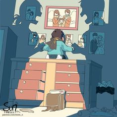

Figure from SUN Project by Mimi N. @futarinotaiyou on Instagram
I came across a youtube channel talking about the truth of family channels which shook me as it was something no one would expect how one would be. Due to how algorithm works, family channels gets quite a handful views which earns them alot of money. Therefore. people are desperate to do so as money is everything to them.
I've came across this amazing artist on Instagram where I got my inspiration for the composition, the tension and way of emphasization.
Inspirations.
I came across a youtube channel talking about the truth of family channels which shook me as it was something no one would expect how one would be. Due to how algorithm works, family channels gets quite a handful views which earns them alot of money. Therefore. people are desperate to do so as money is everything to them.
I've came across this amazing artist on Instagram where I got my inspiration for the composition, the tension and way of emphasization.
Progress 1.
My rough idea for my sketch is to sketch the parents but replacing the heads with a camera to indicate that the children are always recorded and had no privacy. Children in family channels are forced to do things in order for the parents to have a daily posts to engage well on social media. Therefore, I used a puppet to represent a kid being controlled by the parents. I planned to show the emphasization through having two strong elements around the main element.

Lecturer's feedback to the idea was that the idea was interesting with the photos used as inspiration that used many ways to emphasize on the main element.

Progress 2.
Converting my idea sketch into digital art form.


Progress 3.

I tried to include some children drawing at the back to show that the child is being neglected by the parents. I researched on types of drawing a neglected child would draw and tried to replicate some of them according to what they go through and feel.

Final Design

Final design "Eyes on Me"
I added on a black tint on top of them to emphasize on the puppet which is the child. The puppet is in blue to indicate that the child is overwhelmed with sadness as the child is forced to create content for money. The two elements in between indicates the lack of privacy and strong force onto the child. I added on some children drawing at the back in a low opacity to show the truth without showing too much on it.


Comments
Post a Comment